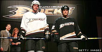
The Anaheim Batarangs?
http://mb3.scout.com/fcarolinacanesfrm1.showMessage?topicID=6851.topic
http://casonblog.blogspot.com/2006/06/breakin-it-down-ducks-new-graphic-id.html
I may or may not get tossed into the frying pan for this, but how can anyone remotely like the new logo, color scheme, and jerseys?!
As I somewhat noted in the title, the logo looks too much like an anime version of Batman's most famous weapon. I know it's supposed to be a duck's foot...but as Cason remarked, did they *really* have to focus on that particular part of a duck? Was the team formerly known as the Mighty Ducks worried that Duck Head would get on their butts about using their logo? Unless I've missed something, Duck Head does not own the rights to a male Mallard's head (or tail)...as a matter of fact, I remember seeing a few years ago, when my dad was starting to really get into stock trading, the occasional ad for some stock outfit that had a male Mallard's head as their logo.
Anyhoo, at least the old logo had hockey elements with the duck head shaped old-timey goalie mask and crossed sticks. Would it get me lynched to say that I actually kind of liked it? Especially when compared to the new logo, which highly reeks of minor-league.
The color scheme...I honestly cannot tell if it's supposed to be gold and green or gold and black. But either way, not the most original colors in the universe, as the Stars or Pens would be quite willing to point out. Not only were eggplant and teal original, but I also never thought they were *that bad looking*, like a ton of people and their brother and cousin.
I don't like the jerseys either...and I honestly do not know why. I suppose it's just that they are rather "blah" looking. And the logo and colors do not help that one bit.
To paraphrase Jon Lovitz, it (all) stinks!
BTW, while I'm at it, why did the (Mighty) Ducks, of all teams, get the "More Cowbell" shirt?

I saw that on the NHL.com store front page one night, and thought "I'd SO LOVE to get a Carolina Hurricanes version of that.", only to find out that the Selannes are the only ones to have such a shirt made for them. Can I get a "That sucks!"?
Current Music: "Cars" by Gary Numan
Edit as of 4:55 PM: Sorry about the double post earlier...somehow didn't even realize I did that until just a few minutes ago. *blushes*
Edit as of 6:55 PM : I think the Ducks like, no, LOVE their new duds...

(Stolen from HockeyNation.)
http://mb3.scout.com/fcarolinacanesfrm1.showMessage?topicID=6851.topic
http://casonblog.blogspot.com/2006/06/breakin-it-down-ducks-new-graphic-id.html
I may or may not get tossed into the frying pan for this, but how can anyone remotely like the new logo, color scheme, and jerseys?!
As I somewhat noted in the title, the logo looks too much like an anime version of Batman's most famous weapon. I know it's supposed to be a duck's foot...but as Cason remarked, did they *really* have to focus on that particular part of a duck? Was the team formerly known as the Mighty Ducks worried that Duck Head would get on their butts about using their logo? Unless I've missed something, Duck Head does not own the rights to a male Mallard's head (or tail)...as a matter of fact, I remember seeing a few years ago, when my dad was starting to really get into stock trading, the occasional ad for some stock outfit that had a male Mallard's head as their logo.
Anyhoo, at least the old logo had hockey elements with the duck head shaped old-timey goalie mask and crossed sticks. Would it get me lynched to say that I actually kind of liked it? Especially when compared to the new logo, which highly reeks of minor-league.
The color scheme...I honestly cannot tell if it's supposed to be gold and green or gold and black. But either way, not the most original colors in the universe, as the Stars or Pens would be quite willing to point out. Not only were eggplant and teal original, but I also never thought they were *that bad looking*, like a ton of people and their brother and cousin.
I don't like the jerseys either...and I honestly do not know why. I suppose it's just that they are rather "blah" looking. And the logo and colors do not help that one bit.
To paraphrase Jon Lovitz, it (all) stinks!
BTW, while I'm at it, why did the (Mighty) Ducks, of all teams, get the "More Cowbell" shirt?

I saw that on the NHL.com store front page one night, and thought "I'd SO LOVE to get a Carolina Hurricanes version of that.", only to find out that the Selannes are the only ones to have such a shirt made for them. Can I get a "That sucks!"?
Current Music: "Cars" by Gary Numan
Edit as of 4:55 PM: Sorry about the double post earlier...somehow didn't even realize I did that until just a few minutes ago. *blushes*
Edit as of 6:55 PM : I think the Ducks like, no, LOVE their new duds...

(Stolen from HockeyNation.)


<< Home