The Buffaloes' New Clothes Revisited
http://sports.espn.go.com/nhl/news/story?id=2590507
http://www.thescoreboards.com/forums/showthread.php?t=2678
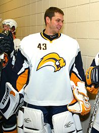
As if the Buffa-Slug (or Barney Rubble's hairpiece) was bad enough...the uniforms are revealed to not only have the slimming look that's been speculated and advertised for ALL TEAMS' uniforms for sometime, BUT ALSO at least one characteristic not too different from soccer uniforms. Can you spot it?
http://sports.espn.go.com/nhl/news/story?id=2590507
http://www.thescoreboards.com/forums/showthread.php?t=2678
As if the Buffa-Slug (or Barney Rubble's hairpiece) was bad enough...the uniforms are revealed to not only have the slimming look that's been speculated and advertised for ALL TEAMS' uniforms for sometime, BUT ALSO at least one characteristic not too different from soccer uniforms. Can you spot it?
If you guessed the number being in the front...bingo. And I honestly do not know how to feel about that. That number, combined with the slimming look, makes it feel like Reebok (and Nike too, considering the unis all countries, but Sweden, wore in this year's Olympics) is *really* trying to make hockey into soccer on ice.
This only makes me cling to my "old-school" jerseys AND wish one of those big-a** spaceships from Independence Day was/is looming over the Reebok headquarters *that much more*.
Oh, and while I'm at it...where is the blue that was advertised as part of the Slugs, I mean, Sabres' new color scheme? All I see is a horrible amalgamation of Pens classic yellow-orange and a bright Predators-like yellow. Bleeeeeech...
Current Music: "Mississippi Queen" by Mountain
posted by Stormbringer at 9/18/2006 12:42:00 PM
![]()


<< Home